Showing posts with label Self directed project. Show all posts
Self-directed Project - Evaluation.
My intentions with my self-directed
project were to explore the themes around the urban environment focusing on
colour, light and structure to create atmosphere. I wanted to produce ideas in
response to what I experienced myself whilst there, looking at locations during
the day and night expressing different colour pallets to show this. It is the
atmosphere felt whilst in a bustling city which captures my attention to colour
and textures in order to represent the environment. The colours within my ideas show what
I see with my own eyes.
(Oxford Circus 2, acrylic,
photography & varnish on MDF, A1)
To begin my project I focused
on ideas which expressed perspective and composition from locations
in both Leicester and also London. It was from
these initial ideas that I began to produce colour responses allowing
me to pick out certain tones that I felt were dominant exaggerating what I saw
within them to create a strong atmosphere placing the viewer in that situation.
I experimented with
many arrangements looking at ideas during the day and night to allow me to
capture contrasting atmospheres through my use of colours and textures. I
started off by developing my ideas using paint brushes as well as pallet
knives. I found that when using the pallet knife I could apply the colours
creating strong textures which in turn emphasis the environment being shown.
When developing my ideas I looked at the composition as a whole and
also zooming in on particular sections that I felt best expressed ideas of
colour and texture without the need to use structures. I found this very
interesting as it allowed me to see how I apply colour and texture together to
generate ideas of a particular location. However after comparing the two
together for me I find painting an environment as a whole more rewarding,
looking at perspective as well as colour and texture. I believe using a strong
sense of perspective combined with colour and mark making pulls in the viewer’s
gaze placing them in that situation.
This idea of exaggerating a
location in terms of colour to help portray what I experienced whilst there
came from my initial research into the Post-Impressionists. They came about
during the 1880's and were a diverse group of artists who took aspects from
impressionism and exaggerated it. For example Van Gogh intensified his already
vibrant colours painting them a lot thicker onto the canvas, a technique known
as impasto. These bolder brush strokes expressed more energetic ideas. The
artists within this group developed a style which focused on the emotional,
structural, symbolic and spiritual elements which they believed to be missing
from impressionism. I think that the influence the post impressionists had on
my ideas is clear. Within my paintings I have exaggerated colour and texture to
help create a particular atmosphere reflecting an urban environment and how I
experienced it.
It was
during the development stages of my ideas that I found the
combination of acrylic paint and photography to be very successful. I found
that this process of using textural paint over a focused image generated ideas
of memory which further more emphasised my personal interpretation. The picture
becomes a captured moment in time, the paint surrounding it representing how I
remember it in terms of atmosphere and emotion. Due to me selecting urban
locations I feel that a variety of audiences could relate to my work as they
may have felt the same busy over whelming emotions that I did when in
particular city environments. I also feel that I have achieved what I set out to with my
own brief to look at urban environments representing them through my own
interpretation; what I experienced whilst there.
Self directed - Colour & texture.
To further refine my ideas; after previously looking at my paintings in detail, picking out particular sections, I decided to re-paint the sections I enjoy. To do this I looked at my most successful ideas zooming in on sections and then with the colours and a large pallet knife painting the textures scaling up in the process. I chose a variety of sections focusing on different tones of light and texture to allow me to represent different city locations at different times. With these paintings my aim is to show a city environment through the use of colour and texture whilst continuing to focus on my experiences representing the environment with the colours and textures that I see. Relating back to my inspiration taken from the Post Impressionists ideas of exaggerating things through use of vibrant colour and textures; I also wanted to create these ideas to see if adding structure is always necessary when depicting a city environment.
(Untitled, acrylic & varnish on cardboard, A3)
(Untitled, acrylic & varnish on chip board, approx. A2)
(Untitled, acrylic on MDF, A4)
(Untitled, acrylic & white emulsion on cardboard, A2)
(Untitled, acrylic on cardboard, A2)
When selecting these compositions I wanted to look at areas using high contrasts between dark and light tones to help reflect the time of day and also focusing on a particular colour pallet that is most dominant throughout the particular idea. To create these I applied the paint quickly to allow me to show movement within the textures which continues to reflect on a city environment full with the hustle and bustle of life. Looking at my new paintings I can see that cool tertiary colours contrasted with bright tones are often used. This helps to create an urban atmosphere; the tertiary tones depicting the concrete buildings and stone floors. The textures used are very linear and coarse in appearance which emphasises the environment creating a sense of movement, direction and depth pulling in the attention of the spectator.
When looking at my ideas in detail, homing in on what is was about the paintings I most enjoyed, I have found that it is my application of texture using a pallet knife that allows me to effectively represent a city environment. The textures used are gestural portraying a great deal of movement which in turn enhances the never ending life of a city.
Comparing these ideas to my paintings which show the environment realistically using perspective and structure, I gain a lot more satisfaction from painting the idea as a scene as opposed to a series of marks. What I enjoy most about painting the location more photographically is being able to enhance to use of perspective combined with colour and texture. This allows me to emphasis the atmosphere, most importantly allowing the viewer to relate to the composition placing them in that busy city environment. The perspective pulls in the spectators gaze, simulating how a city environment can engulf and overwhelm you. In turn this reflects on my own experiences; how I feel in those locations.
Self directed - Looking at my paintings in detail.
After painting my large pieces I wanted to look in detail at what I enjoy most about the ideas, picking out sections that would work well as a composition in its self.
(Above and 1 below - sections taken from 'Oxford Circus 2')
Looking at these sections taken from 'Oxford Circus 2', I chose these due to the intense use of colour which creates a busy atmosphere representing the illuminate lights of a city at night. What I also find interesting about these sections is the application of texture and the contrasts between the large and small marks.
(Above and 2 below - sections from 'Oxford Circus 1')
The three sections presented above are from 'Oxford Circus 1'. I chose these again due to their use of texture and application of the marks made to show structure and contrasts between the dark and light tones.
Studying all of the sections I have selected from my large scale paintings, I have found that my use of colour and application of texture using a pallet knife, does reflect on a city environment creating a bustling atmosphere even though there is not set image of a city in terms of perspective to give the viewer a certain context. Looking closely at these sections, if I were to recreate them I would have to use a larger pallet knife or depending on how large I wanted to go I would have to reconsider the tools I use. I also think it is clear that I enjoy studying the colours and textures within a composition to create a particular atmosphere and environment to pull in the attention of the viewer.
As further development for my project I will look at producing ideas that look only at the use of colour and texture to depict a particular location and time of day. To do this I will select sections from previous pieces of work that I find most interesting recreating them using the same colour pallet and direction of marks.
Self directed project - 2 paintings.
At this current stage of my self-directed project I have
continued to experiment and develop my ideas in particular my uses of colour
and structure to create pieces of work that express my interpretation of the
scene being depicted. With my ideas I want to generate an urban atmosphere
through my use of exaggerated or soft colours and textures, putting the
viewer in that location creating an environment that is bustling with the never
sleeping life of a city.
Throughout my project I have been generating ideas looking at
different times of the day; morning, late afternoon, night time. I did this to
allow me to apply colours that are either muted by the natural hazy late
afternoon light or illuminated by city traffic, street lamps and shops in the
evening. As well as this I have also been playing around with my use of texture
and incorporation of photography. With my ideas, combining them with my
photography I wanted to create a composition that is both blurred and also in
focus, a moment captured whilst in the location and then my memory of the
environment and how I felt at the time, represented through colour and texture,
my own interpretation.
(Oxford Circus 1, acrylic varnish & photography, A1)
(Oxford Circus 2, acrylic varnish & photography, A1)
During my initial research and development stages of my self-directed
project I found it very interesting and enjoyable to create ideas both set in
the day and also at night to help me produce different colour in relation to
the lighting. I love the contrasts between natural light and artificial light
allowing me to creating soft and fluorescent colours yet both creating a sense
of urban atmosphere.
These two paintings shown above are my latest pieces of work,
two large paintings roughly at A1 size depicting the same location at different
times of the day, one during the afternoon and the other late at night.
To create these I used techniques learnt during the development of my
work that worked well. I have combined my photography with my painting process.
I find that by doing this it helps to emphasis the perspective pulling in the viewers’
attention. It also allows my paint work to seem like a memory showing what I
was experiencing at the time, framing the moment captured in that
location. I used acrylic paint to create the work, applying the paint using a
range of pallet knifes to enable me to make texture and layers of colour
to create depth and a sense of movement. The texture created in these helps to
reflect on the city scenes being shown; the marks being the sound and movement
of the people and traffic.
Self directed work in relation to group crit.
As suggested in the the group crit and also in response, I have done some more work looking once again at my use and application of colour. To do some of my ideas I went of previous paintings looking at the colour within the compositions. I also incorporated my use of photography into the ideas as well this time applying a stronger sense of texture the paint used. These ideas also relate to my previous contextual research into the works of Spencer Gore and Oskar Kokoschka who apply bright exaggerated colours to their paintings a long with strong brush marks to help show texture to define the mood and atmosphere of the composition. In my latest pieces of development I wanted to further emphasis the urban atmospheres in my ideas as this, along with my use of structure, is a main element within my concept.
(Untitled, acrylic on paper using pallet knife, A2)
(Untitled, acrylic on card using brush, A2)
(Untitled, acrylic photo cardboard and varnish collage on paper, A2)
To paint the ideas selected above I used a range of pallet knives and brushes also incorporating relief elements within the ideas using corrugated card. Comparing my piece made using a brush against the pieces using a pallet knife, I feel that the textures made by the brush are very flat and bland where as when using a pallet knife I am able to create rough and smooth layers of texture which helps me to put an emphasis on the marks and colours used within my ideas. This then in turn helps me to generate a stronger atmosphere that is endearing to the spectator. Looking at my use of colour in more detail once again, has made me look more closely at my ideas and how I mix colours to represent different times of day and to generate an urban atmosphere.
Contextual Research in relation to group crit - Self directed.
When looking into the work by artists suggested in a previous crit on my self directed project, I found the work by Spencer Gore and Oskar Kokoschka most interesting and relevant to my own work.
Spencer Gore
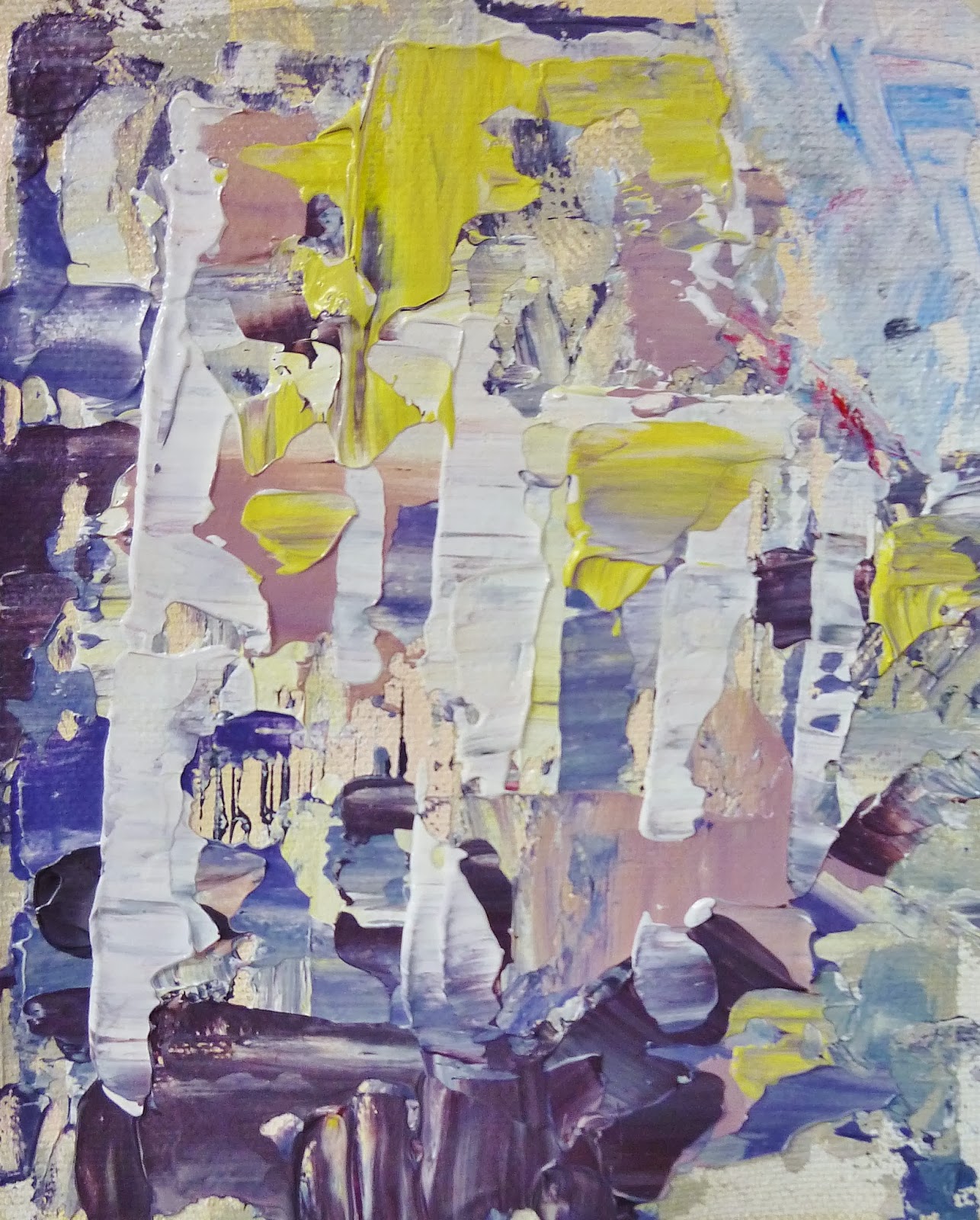
(Somerset Landscape, oil on canvas
1909-10, 41.5 x 50 cm)
(From a canal bridge Chalk Farm Road
oil on canvas, 1913, 43.3 x 68.6 cm)
Spencer Gore was a British born artist, born in 1878 and he unfortunately later died at the young age of 34 in 1914. Gore studied at the Slade school of Fine Art where is was taught under Philip Wilson Steer who became one of his most profound influences which was shown in his early landscape work showing elements of impressionism. Steer himself was inspired by artists such as Claude Monet and Georges Seurat who was a part of the impressionists.
During the early 1900's Gore spent a lot of time in London, Somerset and Dorset producing paintings expressing subjects such as landscapes and theatrical scenes. Gore is most known for his importance within the 'Camden Town Group', and along with fellow artist Walter Sickertt gathering together artists for the Fitzroy Street Group which was an organisation to help support and promote artists. The Camden Town Group was a group consisting 16 of English post-impressionists, men only. Their work was exhibited in the Allied Artist Association a group which was separate from the Royal Academy. Their paintings later went on to be exhibited in the Tate Britain in London. The Fitzroy Street Group was merged with the Camden Town Group in 1913 forming the London Group which still exists today.
Gore's early paintings have a neo-impressionist appearance with the strong use of bright pastel colours and also elements of pointillism. However his later works made in his final years have a strong relation to the post-impressionists with evidence of inspiration from Cezanne and Derain. Gore's paintings were displayed in the post impressionist founder Roger Fry's second exhibition.
Studying paintings by Gore, it is clear that throughout his career he experimented greatly with colour and application of marks to help express emotion and atmosphere within his compositions. He looked at both country and urban landscapes well as portraiture his work gradually increasing in exaggerated tones and shapes which relates back to his inspiration from the post-impressionist artists.
In relation to my own work I find his use of colour pallet particularly interesting as each cool or warm range in tones helps to generate a different atmosphere to complement the subject being depicted. I can relate to this as in my development I am using colours that I see within the environment to show atmosphere and what I felt at the time. Looking at his work this has encouraged me to consider the temperature of colour that I use and what it does to the landscape, how it changed the atmosphere.
Oskar Kokoschka
( Self portrait as a Degenerate Artist
oil on canvas, 1937, 110 x 85 cm)
1886 to 1980, Oskar Kokoschka was a Austrian born artist as well as poet and playwright. He is most famous for his highly expressionist portraits and landscape paintings. He was a soldier in the First World War but was dismissed in 1915 due to being severely wounded. Among his influenced are Gustav Klimt and Adolf Loos who was an architect. During the 1920's he was doing very well exhibiting artwork in Berlin. However when the Nazis came about after WWI, Kokoschka was deemed degenerate (art that did not support the ideas of National Socialism). Many of his paintings were shown in the 'Degenerate Art' exhibition in Munich in 1937 and as a response he produced a self portrait called 'Self Portrait as a Degenerate Artist. He fled to the UK where he remained for the rest of the Second World War. After the war he moved to Switzerland where he remained for the rest of his career.
His most successful works were his portraits. Kokoschka's painting technique was very erratic with a lot of texture and movement creating expressionist paintings. His paintings appear very moody and dark in terms of atmosphere due to the intense application of brush strokes depicting movement and depth. Kokoscha also worked a lot with colour experimenting with complementary and contrasting tones, his paintings often quite cool in temperature. In particular looking at his portraits, Kokoschka generates a lot of emotion though his use of colour and texture.
I feel very inspired by his work in particular his portraits and his ability to generate emotion through his application and use of colour. Within my work I intend to reflect a particular atmosphere through my interpretation of colour. I want to express my emotions in the landscape, how I felt when in that location and how I remember it.
Self Directed Project - Crit 03.03.14
Group Crit.
(My current work for my self directed project)
Points made during my crit:
- work again with using only colour looking at night time and low light contrasts.
- If I go bigger I will need to use bigger tools to compensate.
- continue to play around with perspective; it helps to draw in the viewer and generates a strong atmosphere.
- draw at night to look at light?
- focus on parts; what is it in the paintings I enjoy?
- It is apparent that I am showing my interpretation; what I remember is in focus and what is my memory is blurred (this is a good contrast)
- continue with this; depicting what I felt and saw in the chosen location.
Artists to maybe have a look into:
- Spencer Gore
- Michael Andrews
-Richard Tuttle
- Oskar Kokoschka
- Walter Sickert
-David Hockney's polaroid pictures of Root 66
(Peer Assessment)
My intentions:
After this group crit I felt very positive knowing that what I am doing is working with helpful feedback from the whole group . As suggested I will do a little more into my use of colour showing experimentation with the time of day and also idea of perspective. This will then help me to decide on what I ideas I will represent as my final body of paintings and what colours and application of texture to use to help generate an atmosphere that reflects a city environment.
Self Directed - Further development.
After experimenting with colour, texture and my use of structure I decided to try a previous technique of using my own colour photography against my painting combining them together once again as I felt it had been a previously successful use of media. When doing this I wanted to play around with composition layouts, portrait landscape and also time of day, afternoon contrasted with night. My aim was of this was to show my research into the use of texture and my interpretation of colour and light generated either naturally or by neon city shop lights. I also wanted to reflect on how I interpret my ideas that show a different time of day and the atmospheres created by these in terms of colour, structure and perspective which seems to be a key element that is working within my compositions helping to draw in the attention of the viewer. To paint these ideas I used a range of pallet knives and acrylic paint on a section of my photographs taken whilst on a recent visit to London which helped me to gather many more compositions to play around with in terms of structure and lighting.
(Untitled, acrylic and photograph, on foam board, A1)
(Untitled, acrylic and photograph, on MDF, A3)
I very much enjoyed painting these different ideas; both creating different challenges for me in terms of shadow and light and also emphasising the depth within the pictures. Looking at my use in colour I think that I have experimented positively, applying what I have learnt previously when it was suggested that I focus only on the colours within the environments I am depicting. I think that this helped me to reflect the time of day my ideas are showing.
Self Directed - Development continued.
Continuing with my development of colour and composition I decided to experiment a little more with using only colour and texture to create my ideas instead of incorporating my photography into the arrangement. I felt that I had not fully experimented with colours and tone to represent different times of day. When creating these small paintings shown below I chose ideas that were captured at a time of day that I think were quite difficult to represent; late afternoon as it is beginning to get dark so the cool winter colours are heightened against the city lamps and dark shadows created as the sun sets. The colours used are ones which I felt were dominant in the particular location applied using a small pallet knife. I wanted to reflect an atmosphere of a cool winters afternoon showing my interpretation of the location; how I remember it to be, my memory.
This can be related back to my influences from the white paintings by Maurice Utrillo; he stuck to a limited pallet using white based tones to create a cool atmosphere. My ideas can also relate right back to my research into the work by Sabine Moritz. I feel my work does relate to her ideas in the fact that I am representing atmosphere through my own personal interpretation of colour, almost like a memory.
(Untitled, acrylic on acetate, A4)
(Untitled, acrylic on un primed canvas, A4)
After looking into colour and selecting out the dominant tones showing my interpretation of light and tone, I wanted to play around, incorporating this with my photography adding more formal structure back to my ideas. To do this I stripped my photos of colour so they only consisted of shape in a high contrast monochrome edit. From these I then added colour using my pallet knives as a layer on top of the picture selecting particular areas that I wanted to express making them stand out to the viewer against the dull duo tone of the location. I experimented with applying more or less colour to the pictures and to layer the colour on top I painted onto acetate or placed the acetate over the image to add a contrasting texture to the ideas. I found doing this interesting as I could pick out tones that would contrast against the black and white image behind. This application of high contrast colour and marks related back to my research into Post Impressionism. Even though it is very different, the artists in that group often heightened the colour and texture within their ideas.
(Untitled, acrylic and acetate on photo, A4)
(Untitled, acrylic and acetate on photo, A5)
Self Directed - Development.
After researching a little into my use of colour producing colour pallets of what I see, in a particular location and how I interpret it, I wanted to take a look at producing ideas focused around different times of day. I chose to look into this to capture different types of light and in turn different colours. To create these ideas I wanted to use two different approaches looking at two contrasting locations.
(Untitled, acrylic on foam board, A3)
To create this I wanted to interpret my ideas developed when looking at colour pallets and mark making. I chose to look at the city at night; showing my interpretation of the cool city lights against the night sky showing contrasts between the stationary lights and the moving city traffic. I found creating this rather interesting as I chose to only use a pallet knife to creating fine marks was a challenge but I find the scraping appearance of the texture eye catching.
(Untitled, acrylic and photo collage on foam board, A3)
In contrast to my previous idea I wanted to show my use of colour and texture by combining paint with my photography which I found particularly interesting during my initial idea stage at the beginning of the project. To apply the paint I again only used pallet knifes varying in size to allow me to create different marks more easily. In contrast to my previous idea this combination of paint and photography created a much softer composition which is less noisy due to a use of finer marks and textures.
In terms of my choices in colour, I wanted to reflect what I see within the composition but this time I wanted to be more specific in what colour pallet I chose. This is in relation to my contextual research into Maurice Utrillo and his series of white paintings. What I find interesting about using a certain range of tones is how you can interpret weather and light in different ways generating atmosphere that is felt in that location. This is also a big part of my project. I want to produce ideas that create an atmosphere that is felt when in a city and I want to create this by my choice in subject matter, lighting, colour and also texture. For example the top image shows rough texture which reflects the movement of city traffic at night and in contrast the bottom image is relatively calm with no traffic.
Self directed - Development in response to mini crit.
In response to my mini crit and after conducting some research into the contextual references mentioned I decided to experiment with looking at the colour pallets I use/ interpret within my ideas, focusing only on lines, shape and colour as opposed to showing the detail and textures of the buildings. This then links to the idea of my work relating the work of the Post Impressionists like Van Gogh and Derain. This is due to me applying the colour that I see which may not necessarily be what someone else sees. I will heighten some of the colours making them brighter than they really are. This is because I am painting what I see within the environment. I also wanted to take this opportunity to see what different marks can be made using different tools like pallet knifes, brushes and also larger decorating brushes.
To begin I decided to look at the colours I see my self within the city areas as a whole without focusing in on anything specific. I applied the colours with no real attention to shape and structure to allow me to experiment with tones more easily and freely. Some of the colour pallets were taken whilst outside in the environment and others were taken from studying my photographic research looking at areas within cities.
(Untitled, colour pallet, acrylic on paper, pallet knife)
(Untitled, colour pallet, acrylic on canvas, brush and pallet knife)
(untitled, colour pallet, acrylic on canvas, paint brush)
Studying my experimental colour pallets I can see that I interpret what I see using very cool tertiary grey tones and depending on the light or time of day I will add hints of brighter colours to help make the compositions stand out and to also contrast the colours with one another. I can relate my use of tertiary grey colours to the white paintings by Maurice Utrillo. Like those paintings my use in colour has a running theme of grey which appears to feature throughout my current ideas. I find looking at different times of the day very interesting as you can capture the ideas with different lights, some dull, some bright and later at night the sky is illuminated with the city lights below. I will continue to look at my use of colour but also keep my ideas varied looking different times in the day to capture different qualities of light.
Maurice Utrillo - Self directed project.
During my crit a few artists were mentioned. I decided to do some research into the artist Maurice Utrillo.
He was a self taught French painter who specialised in cityscapes who lived from 1883 to 1955. Utrillo began to drink heavily when he was only a child and he was in fact encouraged to paint by his mother as a distraction. His early paintings were heavily influenced by the artists Camille Pissarro and Alfred Sisley. Pissarro was a French Impressionist during the late 1800's and Sisley was a British Impressionist also during that same time; both painted landscapes. Utrillo painted mainly the streets of Montmartre and also churches. This town was very picturesque and mostly attracted 'quiet artists'. He painted Montmartre as it was before the First World War. He was fascinated by the silent streets and bistros of this particular industrial suburb. In the early stages of his career he would work from what he saw whilst out on the streets on Montmarter however when he reached middle aged his health deteriorated and he could no longer work outside. So instead he worked either from his window, from postcards or from memory. He often used pale tones which can be recognised in particular with his 'white painting' period. After this faze he then started to use brighter colours along with freer brushstrokes and mark making.
When researching Utrillo I found a comment that said he is one of the very few painters whose work pleased both sophisticated minds as well as those with a more simple taste.
In relation to my own work I can find influence from his body of paintings using the white tones. Throughout my initial ideas I have experimented with using tertiary colours to help me create an urban atmosphere and to also reflect on the colours I see within the environment.
( Sacre Coeur de Montmartre et Passage Cottin, 1934)
Post Impressionism - A Summary - Self directed project.
In my Self directed project crit it was commented that my work has a post impressionist theme running through it due to the uses of colour and application of marks. As a part of my contextual research for my final major project I had a quick look into the work of the Post-Impressionists to give my self a better understanding of the artwork being produced at that time.
The time of post impressionism began during the 1880's ending towards the early 1900's. The term 'post impressionism' was invented by Roger Fry, who was both an artist and an art critic, in 1910 as he was getting ready for an exhibition in London describing the development of art after Manet who was involved in the Realist and Impressionist movements. Post impressionism was not a movement but instead a group of artists who rose up against the limitations of Impressionism. Some of the artists included; Vincent Van Gogh, Paul Cezanne and Georges Seurat. Post impressionists were known for pushing the ideas of impressionism into new ideas.
The post impressionists were a group who took aspects from impressionism and exaggerated it. For example Van Gogh intensified his already vibrant colours painting them a lot thicker onto the canvas, using a technique known as impasto. These bold brush strokes expressed more energetic ideas. His work went on to heavily influence expressionism during the 20th Century. The work of Georges Seurat changed during this period going from his broken brushwork during the impressionism to his more detailed work using dots of colour, known as 'Pointillism'. This was then seen as influence to the artists who used a calculated approach to painting in particular abstract art. Paul Cezanne's paintings were very organised consisting of carefully arranged shapes and patterns to form an environment. His paintings had a huge impact on Cubism during the 20th Century.
The artists within this group developed a style which concentrated on the emotional, structural, symbolic and spiritual elements which they believed were missing from impressionism. The work of the post-impressionists went on to form the foundations of Modern Art.
(Paul Cezanne, The Chateau at Medan,
oil on canvas, 1880, 59.1 x 72.4 cm)
(Vincent Van Gogh, The Starry Night,
oil on canvas, 1889, 73.7 x 92.1 cm)
Subscribe to:
Posts (Atom)